A Global Data-Driven VC
That is Shifting Away From The Old Paradigm
Fueled by PASSION, Led by DATA .
We love seeing innovative ideas, are excited to be introduced to new and disruptive technologies, and are passionate about helping entrepreneurs succeed. Therefore, we have developed our two data-driven methodologies:
B2B
Reverse Problem Solving (RPS)

Let your target market speak for itself
We work with large enterprises and Fortune 500 companies in search of existing pain points that can be solved by the right technology. We then find and invest in that technology.
Learn more about RPSB2C
RavingFans®

Let your users tell the tale
An SDK that is backed up by a behavioral psychology model, designed to identify successful habit-forming products at the very early stages by analyzing user behavior patterns.
Learn more about RavingFans®What are we looking for ?
Our ideal investment candidate would be a post-seed startup, whose innovative idea answers an existing market need, and who can demonstrate that by showing hard data and solid numbers. It doesn't matter where you are on the globe, it doesn't matter who you know and who you don't know. If you have the data to back your idea, we want to hear from you.
Think you got what it takes
And have the numbers to prove it?
B2C StartUp?
Download the SDKB2B StartUp?
Contact us Today!For Blockchain/Web 3.0 startups please click here to learn more
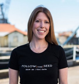
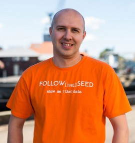
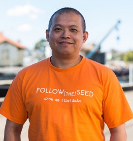
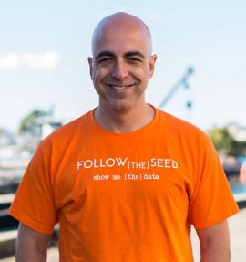
4 Entrepreneurs, 3 Continents, 2 Methodologies, 1 Clear Vision
This is us !
We're a diverse team of entrepreneurs, with partners on three continents, and decades of collective experience in venture capital, startups and technology.

A monetary investment can only take you so far...
We invest money in your business and our skills and experience to help it grow. Beyond the initial funding, we have put together a great team of advisors to help startups grow faster and smarter.